Our New Home.
If you just recently started following our business, we bought a house over a year ago to hold onto instead of flip. It is a quick bike ride to the Village of Pinehurst and is in an area that is developing nicely. We love the idea of George walking to school one day too, as the Pinehurst elementary school is being rebuilt nearby.
To save some money, we decided to rent the house out for one to three years. We knew it was a fixer upper, but didn’t realize how much it was until we had tenants living there full time. To say our tenants were extremely patient is an under statement. To say we didn’t save a single dime within the first year of owning this house is also an understatement. The house needed to be almost entirely re-plumbed while our tenants lived there. We had to replace a dishwasher, faucets, etc. While we had a good handle on flipping houses (as electrical and plumbing were typically redone off the bat), we were pretty clueless about renting out properties. Fortunately, we had a kick ass Property Manager, Mary Margaret, owner of Merit Property Management. She and Jim were certainly very busy getting the house up to livable standards in the first few months.
Once we worked out the kinks, our tenants asked if they could extend their lease when it came time to renew. I thought they were crazy, but I was pumped. Within the first few months of renting, they had re-graveled our entire driveway, built a little garden box in replacement of where an oil tank used to be buried, revamped our landscaping, and painted mostly every wall in the house Agreeable Gray by Sherwin-Williams. Not to mention the house was in its peak clean state.
But all good things must come to an end because our tenants decided to buy the house next door! This left us with a tough decision to make—whether to move in ourselves or rent it out to a new family. It goes without saying the bar was set extremely high for future tenants. Jim has repaired various rental properties over the past couple years, giving him a firsthand experience of what an awful tenant looks like. We knew we may not luck out again.
So, we decided to officially move into our house this past October. The house is relatively old (as we found some old knob and tube wiring), but it had seen some electrical and aesthetic updates especially in the 80s. We did some research at the Tufts Library in Pinehurst and discovered this home was actually owned by golf course designer, Donald Ross, at some point and was originally named The Sperry Cottage. It was also in another part of the Village of Pinehurst, but was relocated during the 50s.
We love that this house has so much history and character and can’t wait to restore it.
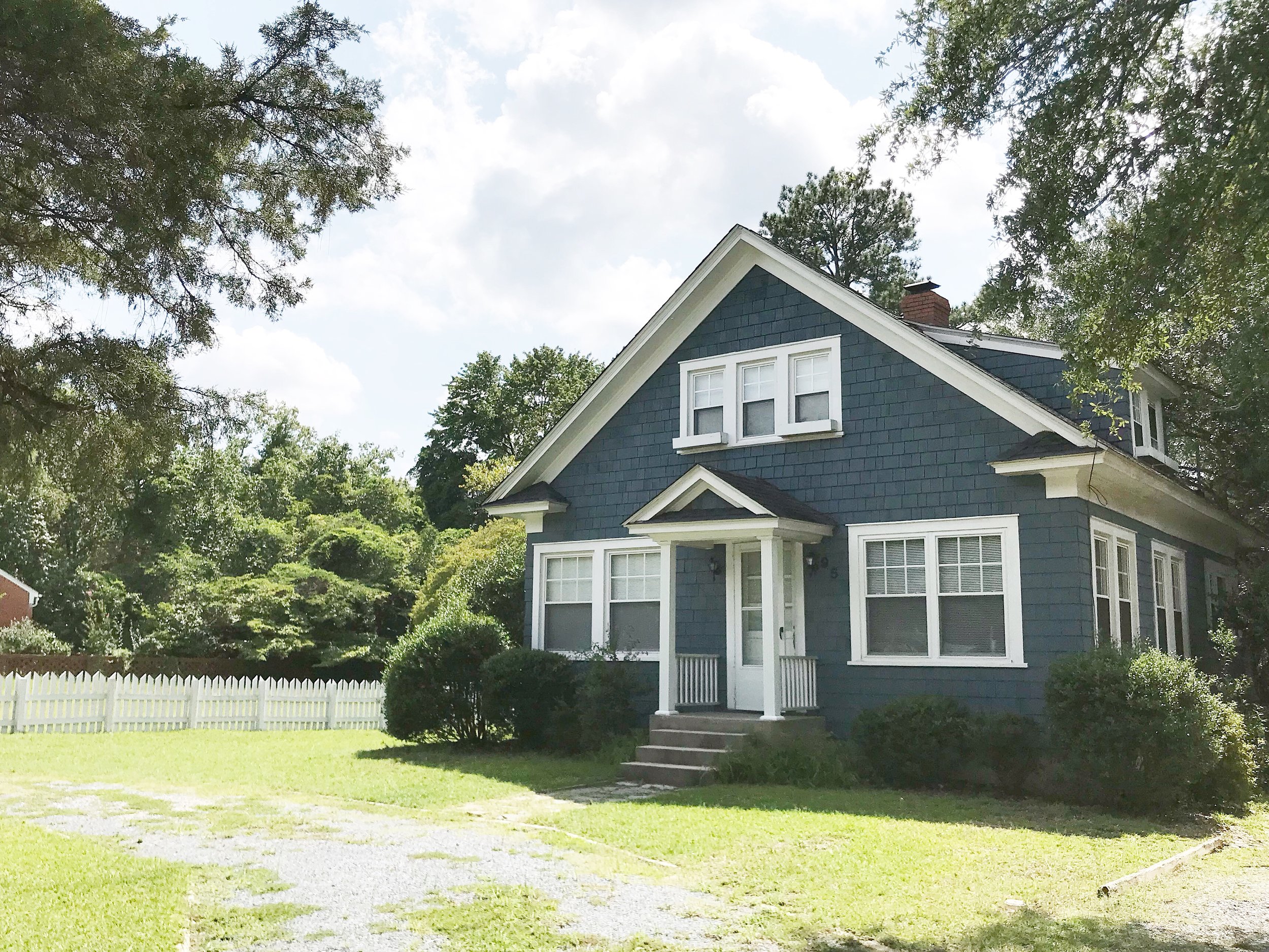
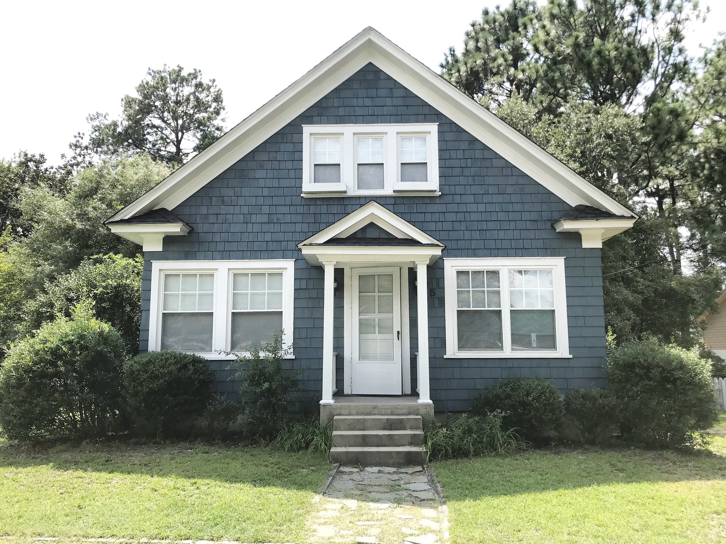
Our little blue house! (Before the new gravel driveway)
And without further ado, here is a mini tour of the place in all its vintage glory:
The Kitchen.
What we plan to update:
Currently the kitchen floor has some sloping so we will want to fix the structural issues before we really get down to renovating in the future. We will probably slightly extend the back of the mudroom area to the left of the kitchen. The back half of the kitchen actually contains both dining and laundry so we will want to relocate the laundry area into the mudroom without drastically changing the footprint of the home. We love that this home is quaint and don’t want to get too crazy with extensions. The red/pink wallpaper was super rad (most likely from the 80s) however had seen some wear and staining over the years. Our tenant ended up painting the wallpaper before we moved in so we will need to address that down the road. We recently discovered that there is heart pine under two layers of linoleum flooring. This is likely going to be a headache to properly restore, but we are up for the challenge.
What we love about this space:
We love the character of the swinging solid wood door leading into the kitchen. We also love the archway separating the kitchen area from the dining/laundry and will aim to salvage this feature when renovating down the road.
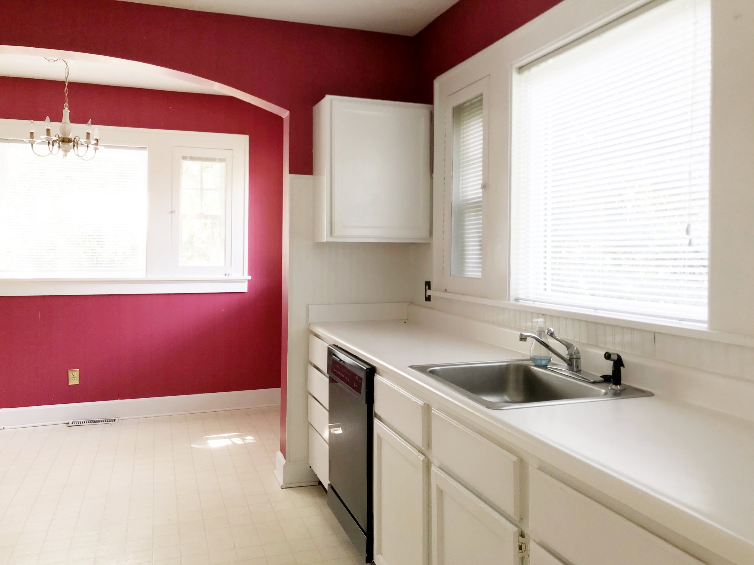
Laundry area strategically cropped out of photo.

That swinging door, though!
The Living Area.
What we plan to update:
Mostly aesthetic updates especially addressing the mismatched flooring. Half the room is quarter sawn heart pine and the rest is regular pine (you can even see in photo below). We will also revamp the fireplace. There is brick behind the sheetrock above the mantel; however it is not pointed as nicely as the brick that is exposed.
WHAT WE LOVE ABOUT THIS SPACE:
The wood burning fireplace (after some aesthetic updates of course)!

Just need some aesthetic updates in the living area.
The Master Bedroom.
what we plan to update:
The master is currently on the first floor next to the living area; however we are converting it into an office space for the time being with only one kid. Where we lived previously, all my artwork and company paperwork was strewn about the entire home so I want to be sure to contain all of it somewhere, especially in a significantly smaller house.
What we love about this space:
The solid wood doors and antique hardware. And all the windows on the lefthand side of room (not pictured).

Those solid wood doors and antique hardware!
The Guest Bedrooms.
what we plan to update:
Again, mostly aesthetic updates -- new paint, light fixtures, etc.
What we love about this space:
The built-in dressers! A great way to help address the limited storage space issue as the rooms, although cute, are tiny. We will likely rebuild these and properly insulate down the road, though.

Both guest bedrooms have built-in dressers that allow more space for living!
The Office Nook.
what we plan to update:
We plan to swap out the upper cabinetry for some open shelving so the space seems less claustrophobic. Jim is excited to turn this into a fly-tying and office space for himself.
What we love about this space:
The fact that this feature even exists.

A cute little open area on the second floor to the left of the stairs.
The Exterior.
what we plan to update:
In terms of landscaping, we want to improve the circular drive in front of the home. We think a front porch would also be a nice feature since it's across from the baseball field. Instead of a shed in the back, we plan to build a secondary, small accessory building for Jim's workshop and possibly an art /hobby studio above it. We will eventually eliminate the not-so-aesthetically-pleasing back deck and replace with a stone patio.
What we love about the exterior:
The adorable wooden window boxes. The fact that the exterior is cedar shingles. And the unique white picket fence (pictured above).
The window boxes on the second floor are simply darling.

Back deck will likely be eliminated to accommodate a higher end-looking patio.